
Back to list
Mobile/tablet
Adjust your website for mobile devices.
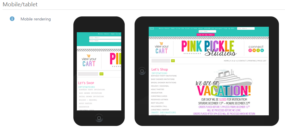
The website can be adjusted to view on a PC display, but the information can be displayed improperly on mobile devices. In this case, you may lose some of your visitors.If you don’t have a mobile device near at hand to check how your website appears on a small screen, use the feature Mobile rendering. Open the section Website Analyzer and go to the filed Mobile/tablet.
In this section you can check:
- If it is comfortable for the user to work with your website on their smartphone and tablet PC screens.
- If the website functional is adapted for touch-screen gadgets.
- If the website structure and design remains unaltered.
If you make some changes on your website, please update the Semalt Website Analyzer page to see them in the field Mobile/tablet.


